Close your eyes and think of a kitchen island. Now, what do you see? I’m guessing it’s probably a wooden rectangle with cabinet doors on one side and a slab of stone on top. Pretty standard stuff. And there’s absolutely nothing wrong with an island like that! But what if you long for something more? Today, I’m turning the conventional kitchen island on its head and exploring some unique designs with unconventional use of materials, different layouts, and alternative shapes.
Unique Kitchen Island Design Idea #1 – Use the Same Material All Over
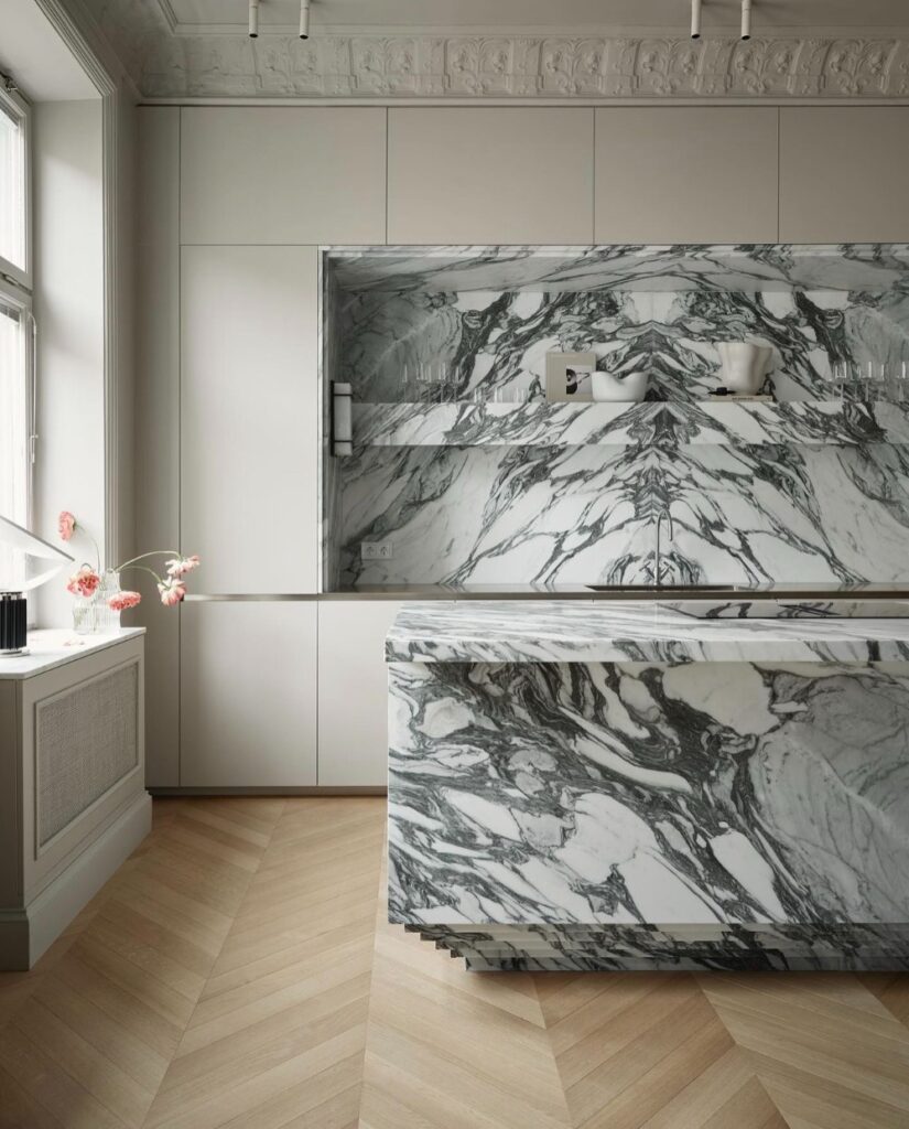
Oh my god, are we in kitchen island paradise or what?! This beauty is all decked out in dramatically veined marble, and honestly, it’s a total showstopper. And can we talk about the base for a second? Those staggered, inverted steps? Chef’s kiss. This is such a cool way to make a statement if you’re not sweating the extra storage space from cabinets. Bold move, and I’m here for it.
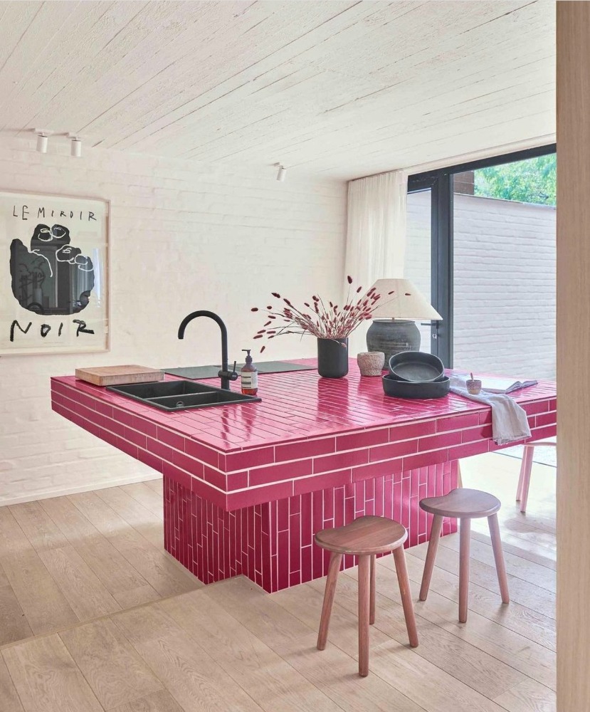
Hey, Barbie-core vibes! This island is rockin’ the subway tile look—way easier on the wallet than the marble option above. But instead of playing it safe with basic white, the designer went all in with a bold, vibrant pink, adding a serious pop of personality and fun. And can we talk about how they flipped the base and top tiles in opposite directions? Talk about a game-changer.
Unique Kitchen Island Design Idea #2– Skip the Barstools
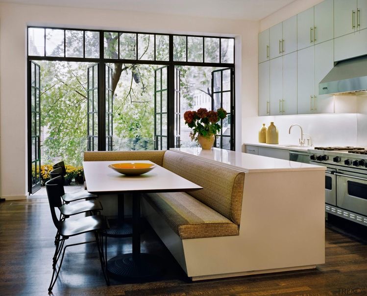
Now *this* is what we call a genius move. This kitchen island has a built-in banquette on one side, totally giving barstools the side-eye and saying, “Nah, we’re good.” It’s cozy, it’s inviting, and it instantly becomes the go-to spot for everyone to hang out. Plus, with that extra seating, you can fit in more friends, family, or whoever’s lucky enough to snag a spot. Bonus points for not needing a whole dining set up in the kitchen—space-saving at its finest. Obsessed? Same.

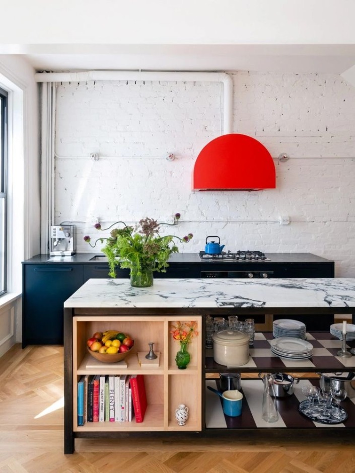
Here’s another fun twist on the usual ‘barstools at the island’ setup. This kitchen went with open shelving on the island instead, which gives the whole space a light, airy feel. And those black-and-white patterned shelf bottoms are a total personality boost. But let’s talk about the real MVP—the built-in bookshelf. Not only is it practical, but it also lets the homeowner show off a little personality with their favorite reads or knick-knacks. It’s the perfect mix of fun and function.
Unique Kitchen Island Design Idea #3– Embrace New Shapes
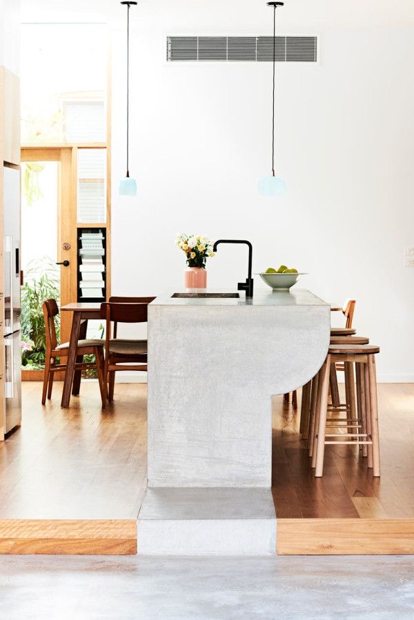
Why stick to boring ol’ rectangles when you can throw in some curves that’ll make your kitchen island look next-level? I mean, look at that beauty up there! And don’t even get me started on that waterfall edge—it’s like it’s melting right onto the floor and down the stairs. This is the kind of design magic that makes life a little sweeter, just sayin’.
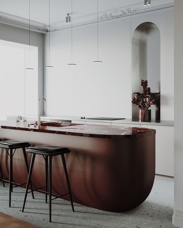
You can’t help but zero in on that kitchen island, right? It’s like the cool kid at the party that everyone’s staring at. Unlike the usual straight-edged, boxy islands, this one’s got curves for days. Those soft, rounded edges and the circular base make it feel… weirdly huggable. Like it’s just *welcoming* you into the room. Is it strange that I kind of want to hug it? Wait, don’t answer that. 😉
When it comes to kitchen design, your island doesn’t *just* have to be a functional workhorse—it can totally steal the show and be as fun and funky as you are. Why settle for basic when you can create an island that’s a total conversation starter? The trick is to get creative, ditch the rules, and embrace options that break the mold. Think outside the box (or the countertop), and don’t be afraid to venture where no one else dares to go. Your kitchen, your rules.
+ view the comments


